Newborn portrait art | Arvada Colorado Newborn photographer
4 tips for creating the perfect newborn portrait display
1. “Match the couch”
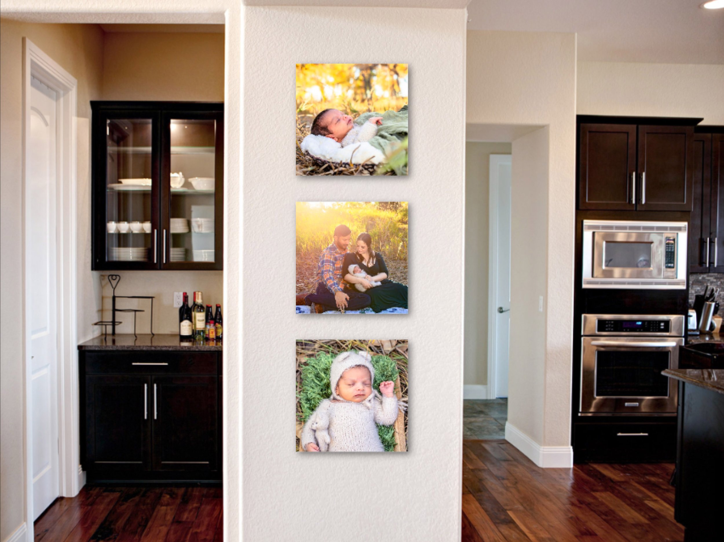
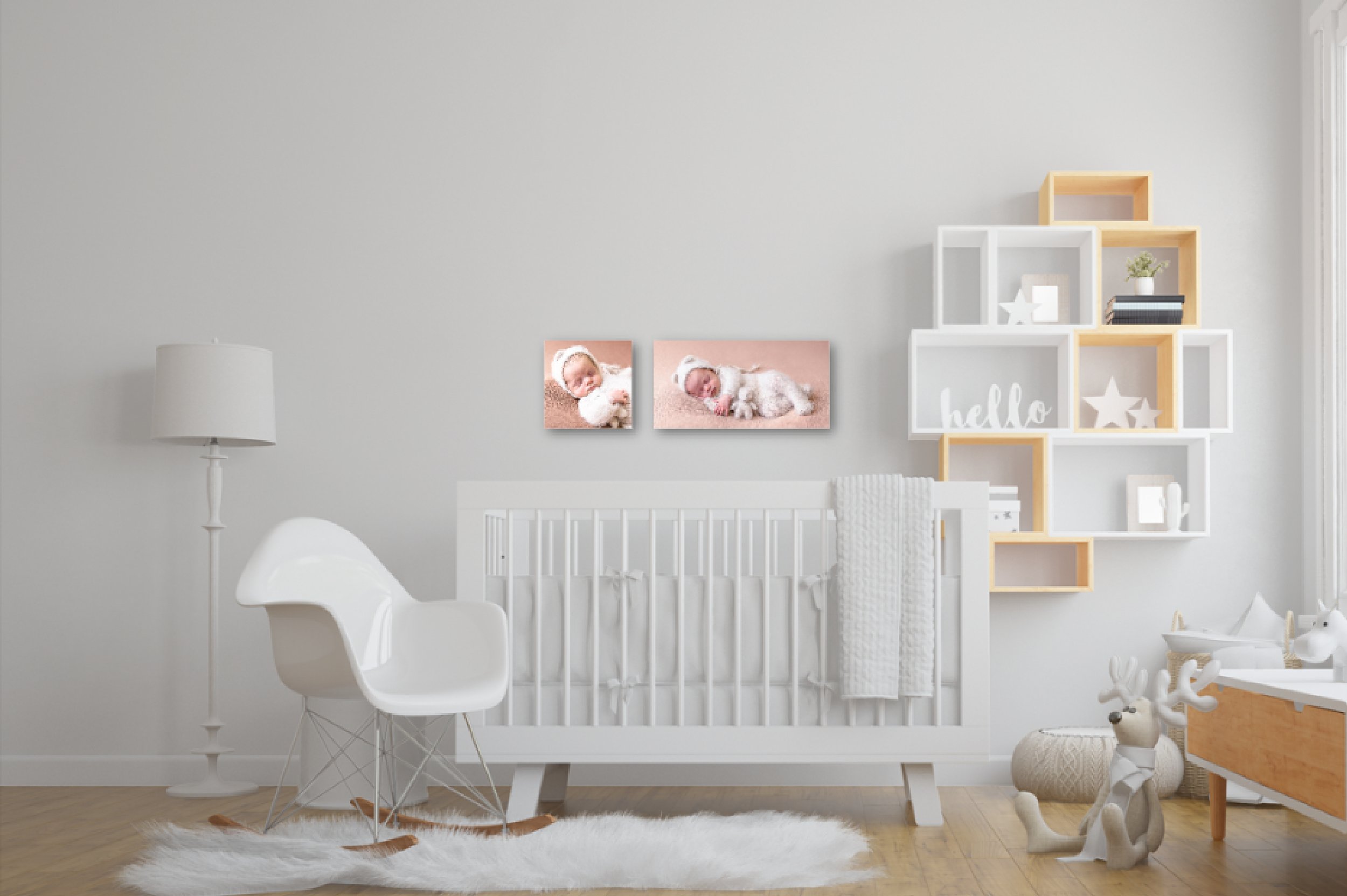
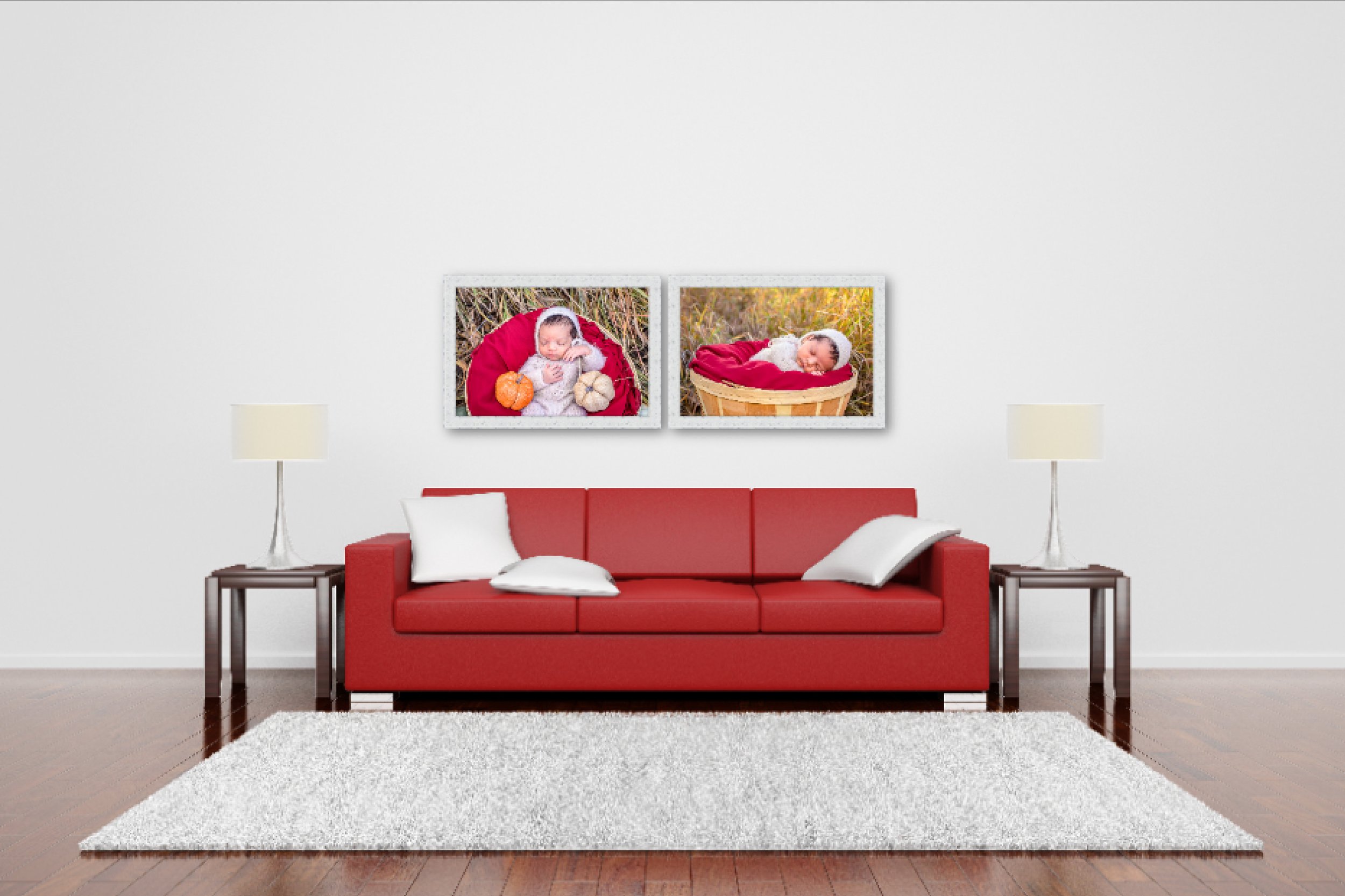
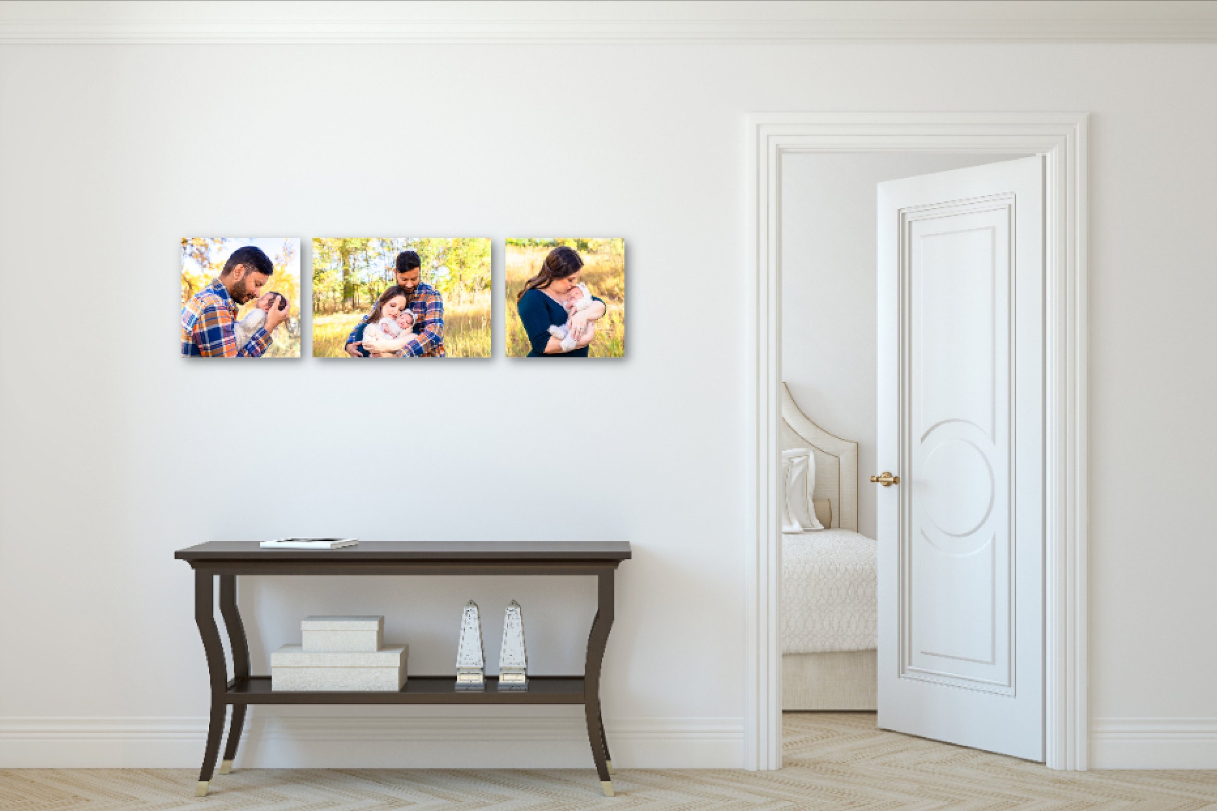
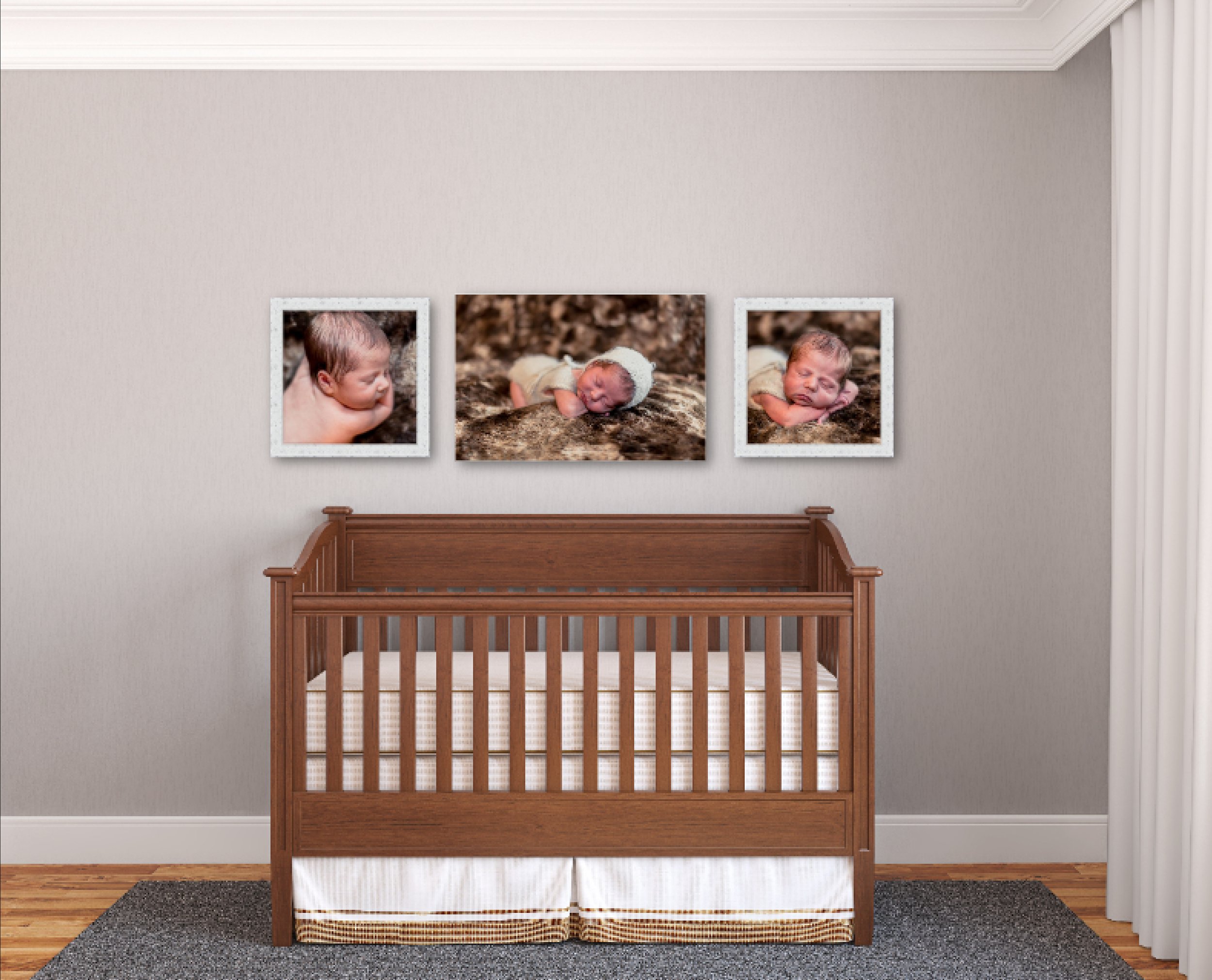
One of my favorite portrait art mentors tells her students to have your clients “dress to match the couch”. Why? Because it guarantees that your images are going to look amazing hanging above your couch. In the case of newborn portraits this advice isn’t always as simple. First many people want to hang the newborn portraits in the baby’s room, so maybe this looks more like “dress to match the crib”, or maybe you would like to hang the images in more than one location, for example baby alone in babies room, family portraits with your new baby over the couch and a few images in your bedroom. With newborn portraits there is an easy way to make this work, during our consultation we will talk over the places you would like to hang your images and the colors in that room. Mom, dad and any siblings can dress to match the living room colors, and then I can choose outfits and wraps for baby’ solo portraits to match the colors in the other two rooms. This way the images fit seamlessly into each space as if they were designed for it, because they were!
2. Choose a wall art style or frame that matches the look of your home
As much as I love the look of my heritage wood prints, if you have a very modern style of home they are not going to look right in your space. On the other hand if your design style is country farmhouse, a sleek metal framed print is not going to be the best fit for your home. When I sit down with my clients to design their art I take all of this into consideration, I show my clients the options and then I suggest the style I believe will look best with their current décor. For those clients that don’t really have a design style yet I’ll help you choose your favorite option and it may be the perfect base to help you create a look in your home that you love!
3. Choose nontraditional shapes
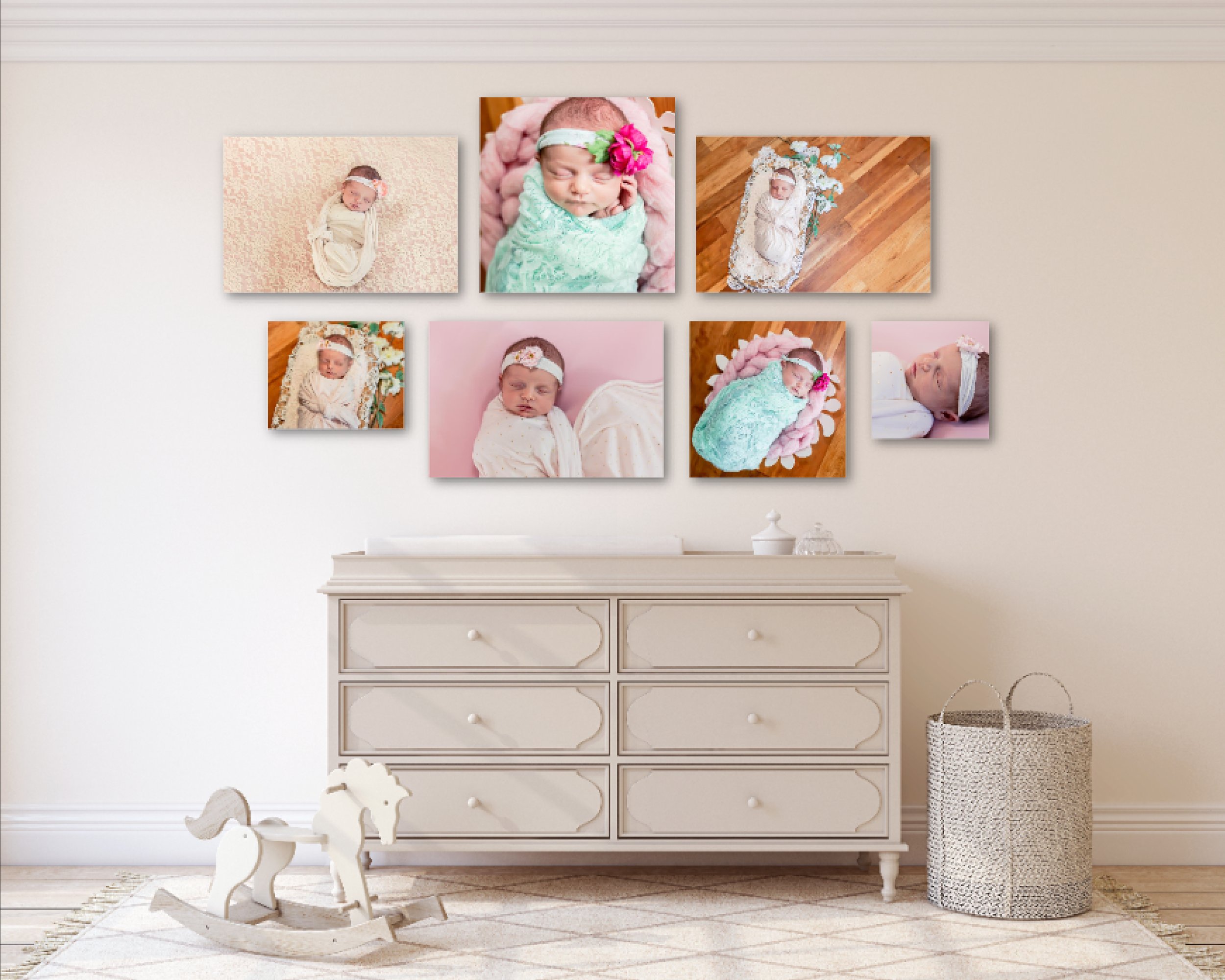
If your wall art is all feeling boring and the same this might be a great way to mix it up a little. I offer many traditional sizes like 16x24, 30x40 and 40x60 however I also offer square, round and long and narrow images. I will typically design a sample set for each client with more traditional sizes and one with a more unique layout to help you choose which option is more your style. Below you can see several mock ups with both traditional and nontraditional shapes as well as samples with a mixture of both. These are all real samples that I presented to my clients.
4. Consider one large image
I love creating art sets with a variety of sizes and shapes, but sometimes what you really need is one statement piece. Especially in a larger room where smaller images are harder to see from the other side of the room, a larger image is more appropriate. So how do you know how large of an image to choose? One thing to consider is the size of the piece of furniture you will be hanging it over, the image should be 50-75% smaller than the furniture. Another thing to keep in mind is the size of the room, just like choosing TV sizes the further you will be sitting or standing from the image, the larger it needs to be. If wouldn’t put a 20 inch tv in your living room so an 8x10 or 11x14 print is also going to be too small to see clearly and make the statement you are looking for in this larger space.
If you are ready to schedule your newborn session and have custom art created for your home I would love to schedule a call to talk with you. Click the button below to start the process and learn more about my sessions.
Jennifer Tavera is a Luxury family, maternity and newborn photographer in Denver Colorado who specializes in creating an experience that will make mom feel confortable, papered and beautiful so she will be excited to turn her portraits into art for her home. Sessions are available outdoors all over the Denver and Boulder area and studio sessions in the studio space in Arvada. Ready to start planning your dream session? Click below to schedule a call.
